
Recently Asked Questions and Answers
1. How to set the border style as dotted?
The CSS
2. What is the CSS border radius property?
The CSS
Example:
3. How to create a circular HTML button element using CSS?
We can create a circular HTML
- Apply the same width and height to the HTML buttonelement
- Apply the CSS border-radiusproperty with the value50%to the HTMLbuttonelement.
Example:
4. What is the sequence of CSS margin properties?
- The sequence of CSS margin properties is margin-top,margin-right,margin-bottom,margin-left.
5. What is the CSS box model?
The CSS box model is essentially a box that wraps around every HTML element. It consists of margin, border, padding, and the actual content.
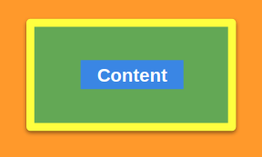
Content - The content of the box, where text and images appear. It represents the blue color in the above image. Padding - A transparent space between the content and the border. It represents the green color in the above image. Border - A borderline that goes around the padding and content. It represents the yellow color in the above image. Margin - A transparent space outside the border. It represents the orange color in the above image.
6. What are the CSS Box properties?
The following are the CSS Box Properties:
- height
- width
- border-style
- border-width
- border-color
- margin
- padding
7. What is the CSS box sizing property?
The CSS
The values of the CSS
content-box: (Default) The width and height properties include only content, but they do not include the padding, border, or margin.
CSSborder-box: The width and height properties include the content, padding, and border, but they do not include the margin.
CSS
8. Explain media queries and why are they used?
Media queries play a crucial part while developing Responsive Layouts.
Using Media queries, we can conditionally apply styles based on the device type (e.g. printers, TVs, etc.) and media features (e.g. viewport width, etc.).
Syntax:
- Media Type: Media type describes the general category of devices. Possible types of media are screen, print, tv, all, etc.
- Media Feature: Using Media Features, we can write Media Query for a specific feature. Examples: width, height, orientation, etc.
9. How to apply background color for an HTML element in only small devices?
We can apply background color for an HTML element in only small devices using media queries with the media feature
Example:
10. How to create a responsive website without Bootstrap?
We can create a responsive website using media queries or flexbox without Bootstrap.
11. How to hide the container (div) element on mobiles and show it on iPad and desktop?
We can hide the container (
Example: Using Media Queries
12. What is a media type in a media query?
Media types describe the general category of devices.
Possible types of media are:
- screen- For all Screened devices (mobiles, laptops, tablets, etc.)
- print- For Printers.
- tv- For Televisions.
- all- Matches all types of devices and more...
Example:
13. What is the syntax for a CSS Media Query?
Syntax:
- Media types describe the general category of devices. Examples: screen,print,tv,all.
- Media Features include features like width, height, orientation, etc.
We can combine multiple Media Features in a single Media Query using Logical Operators and the comma operator.
Example: Using comma operator
14. How to align the two HTML container (div) elements in a single row?
Making the HTML container elements as inline elements
- Apply CSS displayproperty with the valueinlineto both the HTML container (div) elements.
- Apply CSS
Making the HTML container elements as flex-items
- Wrap the two HTML container elements in another container element. Apply CSS displayproperty with the valueflexto the parent element of two HTML container elements
- Wrap the two HTML container elements in another container element. Apply CSS
15. What is CSS Flexbox?
The CSS Flexbox is a layout method that helps to arrange the HTML elements in rows (horizontally) or columns (vertically).
16. How to align the HTML elements inside the container element in a row using the CSS flexbox properties?
We can align the HTML elements inside the container element in a row by:
- Making the HTML container element as Flexbox container
- Specifying the flex direction as a row to the HTML container element. (You can skip it as flex direction is row by default)
17. What is the CSS display property in Flexbox?
The CSS
Providing
18. What are the CSS Flexbox properties?
Some of the CSS Flexbox properties are:
- display
- flex-direction
- justify-content
- align-items
- flex-wrap
- flex-flow
- align-content
- align-self
- flex-grow
- flex-basis
- flex-shrink
- order, etc.
19. What is meant by the CSS justify content property?
The CSS
The values of the CSS
| Value | Description |
|---|---|
| flex-start (default) | flex-items will arrange to the start of the flexbox container |
| center | flex-items will arrange to the center of the flexbox container |
| flex-end | flex-items will arrange to the end of the flexbox container |
| space-between | Left-over space will be arranged in between the flex-items |
| space-around | Left-over space will be arranged around each flex-item |
20. What is CSS flex property?
The CSS
It is a shorthand property for
The CSS
Example: Using three values syntax
Common Values for CSS
| Value | Description |
|---|---|
| flex: 0 auto; (Default) | Same as flex: initial; and is shorthand for flex: 0 1 auto; |
| flex: auto; | Same as flex: 1 1 auto; |
| flex: none; | Same as flex: 0 0 auto; |
21. What are the uses of CSS Flexbox?
The CSS Flexbox allows us to have more control over the alignment and behaviour of boxes/divs/page elements when changing screen sizes or device orientation.
Some of the uses of CSS Flexbox are:
- It sets flexible width/height of elements depending on available space.
- It centers the elements in both vertical and horizontal without any hacks and workaround solutions.
- It alters the order of elements inside the layout without affecting markup and document structure (using either order property or flex-flow).
22. Explain CSS Flexbox properties?
Some of the CSS Flexbox properties are:
- Flex Direction:
The CSS
The values of the CSS
| Value | Description |
|---|---|
row | Direction of the flex-items is horizontal |
column | Direction of the flex-items is vertical |
- Justify Content:
The CSS
The values of the CSS
| Value | Description |
|---|---|
| flex-start (default) | flex-items will arrange to the start of the flexbox container |
| center | flex-items will arrange to the center of the flexbox container |
| flex-end | flex-items will arrange to the end of the flexbox container |
| space-between | Left-over space will be arranged in between the flex-items |
| space-around | Left-over space will be arranged around each flex-item |
- Align Items:
The CSS
The values of the CSS
| Value | Description |
|---|---|
| stretch (default) | If the flex-direction is row , flex-items will stretch to their available height. |
| flex-start | flex-items will be at the start of the flexbox container |
| center | If the flex-direction is row , flex-items will be at the center of the available height in the flexbox container |
| flex-end | If the flex-direction is row , flex-items will be at the end of the available height in the flexbox container |