
1. Styling React Components
React Components can be styled in different ways:
- Using CSS
- CSS-in-JS
- SASS & SCSS
- many more...
1.1 Using CSS
Writing CSS in external CSS files for each component and passing class name as a value to the className attribute.
File: src/App.js
File: src/App.css
1.2 CSS-in-JS
CSS-in-JS is a styling technique where JavaScript is used to style React Components. It can be implemented using the below third party packages.
- Styled Components
- Emotion
- Radium many more...
2. Styled Components
Styled Components are one of the new ways to use CSS in modern JavaScript. Components are used to reuse code, similarly Styled Components are used to reuse styles.
2.1 Installation
2.2 Syntax
Within the template literals (), we define the styles.
2.3 Importing styled
In general, styled components are placed inside the styledComponents.js file.
File: src/styledComponents.js
styled is an internal utility method that transforms the styling from JavaScript into actual CSS.
2.4 Creating and Exporting Styled Component
File: src/styledComponents.js
2.5 Importing and Rendering Styled Component
File: src/App.js
2.6 Adapting based on props
- With styled components we can re-use the styles created.
Syntax:
Example:
File: src/App.js
File: src/styledComponents.js
- Value passed as prop can be accessed as props.propName.
2.7 Modularity of Code
Example:
File: src/App.js
The color and bgColor are the part of styling, instead of passing them as props, we can passthe type of button to handle styles in styled components.
2.8 Conditional Styling using Props
Example:
File: src/App.js
File: src/styledComponents.js
3.Advantages of Styled Components
3.1 Unique Class Names
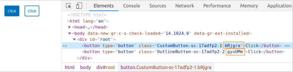
Styled Components generate a unique class name(s) for your styles.
Example:
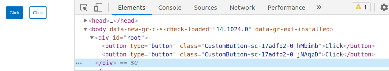
3.2 Elimination of dead styles
Styled components remove unused styles, even if they’re declared in your code.
3.3 Dynamic Styling
- Let’s assume we have two types of buttons on our page, one with a white background, and the other navy blue.
- We do not have to create two styled-components for them. We can adapt their styling based on their props.
File:src/styledComponents.js
File:src/App.js
3.4 Can differentiate between the types of props they receive
File:src/App.js
You’ll notice, though, that we haven’t given our button a type in the above code snippet. Let’s do that:
File:src/App.js
Styled components can differentiate between the types of props they receive. They know that type is an HTML attribute, so they render
3.5 Easier Debugging
- babel-plugin-styled-components plugin adds support for a nicer debugging experience.
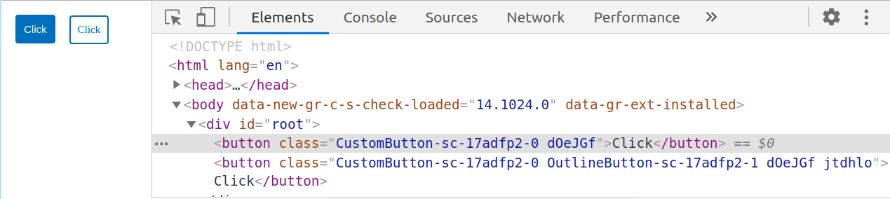
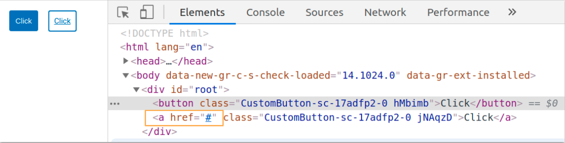
- This option enhances the attached CSS class name on each component with richer output to help identify your components in the DOM without React DevTools. In your page source you'll see: <button type="button" class="CustomButton-asdfxxx asdfxx" />instead of just<button type="button" class="asdfxxx" />.
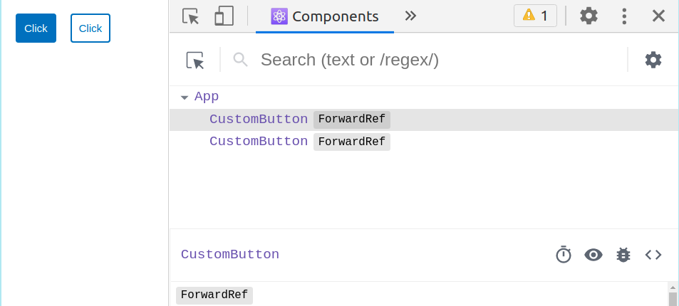
- It also allows you to see the component's displayName in React DevTools. For example, consider writing a styled component that renders a button element, called CustomButton. It will normally show up in DevTools as styled.button, but with the displayName option enabled, it has the name you gave it CustomButton.
This makes it easier to find your components and to figure out where they live in your app.
For more info, you can go through this link here.
In order to configure create-react-app with the babel-plugin-styled-components, we have to use craco - Create React App Configuration Override is an easy and comprehensible configuration layer for create-react-app.
We’ll need to install craco with npm, and then create a craco.config.js at the root of our application, with the content:
It is already configured.
3.6 Global Styling
- We will write global styles in the styledComponents.jsfile. Inside theGlobalStylevariable is where we define all global styles.
- We will import GlobalStylecomponent and place it at the top of React tree. In many react applications, that’s typically theApp.jsfile.
- createGlobalStyleis a helper function to generate a special StyledComponent that handles global styles.
- Normally, styled-components are automatically scoped to a local CSS class and therefore isolated from other components. In the case of createGlobalStyle, this limitation is removed.
Example:
File: src/styledComponents.js
File: src/App.js
- To know more, you can go through this link.
4. Extending Styles
- Frequently you might want to use a component, but change it slightly for a single case. Now, you could pass in a function and change them based on some props, but that's quite a lot of effort for overriding the styles once.
- To easily make a new component that inherits the styling of another, just wrap it in the styled(). Here we use the CustomButton and create a special one, extending it with some color-related styling.
- Now we need to create another StyledComponent with similar properties of CustomButton except color and border-color property.
It’s more or less like how the spread operator works.
To know more, you can go through this link.
5. The "as" prop
- You can pass the as prop to your styled component with the value of your preferred element.
- If you want to keep all the styling you've applied to a component but just switch out what's being ultimately rendered (be it a different HTML tag or a different custom component), you can use the "as" prop to do this at runtime.
Example:
File:src/App.js
File:src/styledComponents.js
- Consider the above code snippet, here the OutlineButton styled component is rendered as a button element, but you would prefer an anchor to a button for OutlineButton, you can pass the asa prop to your styled component with the value of your preferred element.
- This sort of thing is very useful in use cases like a navigation bar where some of the items should be links and some just buttons, but all be styled the same way.
6. Boolean Attribute
- The Presence of boolean attribute is taken as true no need to specify the value again.
- The absence of boolean attribute is taken as false.