
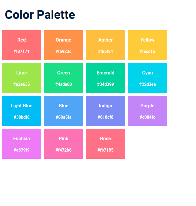
Color Palette
In this assignment, let's build a Color Palette by applying the CSS concepts we learned till now.
Refer to the below image.
Instructions:
- The text on each card should be centered vertically and horizontally.
- The colors should wrap into multiple lines based on the width available.
- Achieve the design using the CSS Flexbox layout.
- Try to achieve the design as close as possible.
CSS Colors used:
Text Color Hex Codes Used:
Background Color Hex Codes Used:
CSS Font families used:
- Roboto
Concepts Review
Want to quickly review some of the concepts you’ve been learning?
Take a look at the Cheat Sheets.
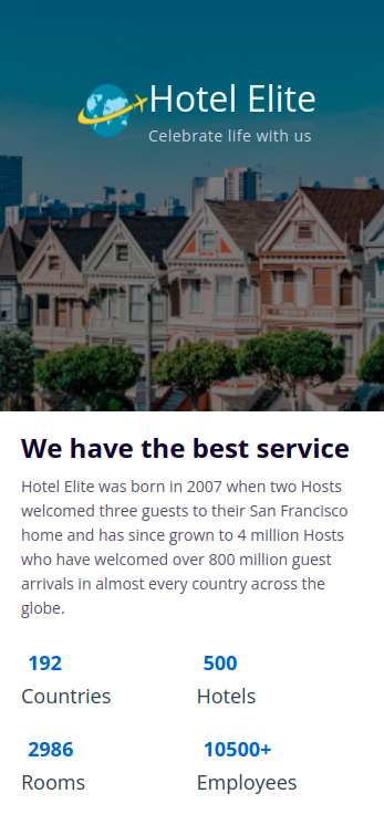
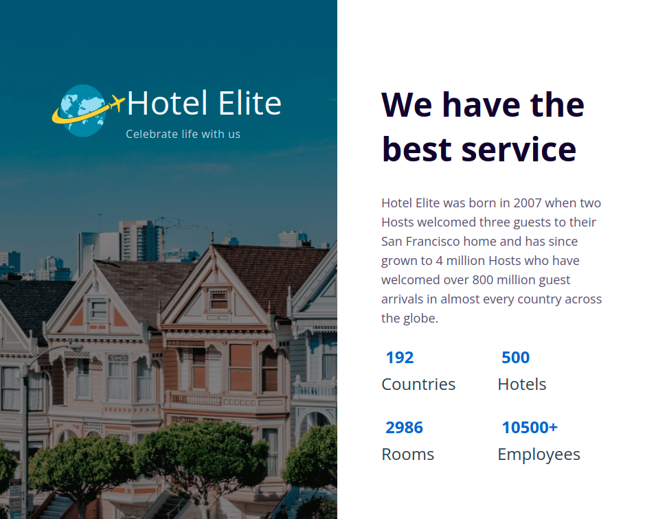
In this assignment, let's build a Best Service Stats page by applying the CSS concepts we learned till now.
Refer to the below images.
The following images illustrate all device sizes, from extra small to extra large.
Extra Small (Size < 576px), Small (Size >= 576px) and Medium (Size >= 768px):
Large (Size >= 992px), Extra Large (Size >= 1200px):
Instructions:
- Add the given images as background images to an HTML container element
- The page should have two different background images in devices below 992px and devices equal and above 992px
- The HTML main heading element should have different font-sizes in devices below 992px and devices equal and above 992px
- The stats should be wrapped into multiple lines
- Achieve the design using the CSS Flexbox layout and media queries.
- Try to achieve the design as close as possible.
Resources
- https://assets.ccbp.in/frontend/intermediate-rwd/best-service-stats-website-logo.png
- https://assets.ccbp.in/frontend/intermediate-rwd/best-service-stats-sm-bg.png
- https://assets.ccbp.in/frontend/intermediate-rwd/best-service-stats-lg-bg-v1.png
CSS Colors used:
CSS Font families used:
- Open Sans
Concepts Review
Want to quickly review some of the concepts you’ve been learning?
Take a look at the Cheat Sheets.
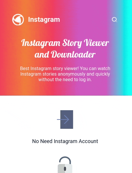
In this assignment, let's build an Instagram Story Viewer page by applying the CSS concepts we learned till now.
Refer to the below images.
The following images illustrate all device sizes, from extra small to extra large.
Extra Small (Size < 576px), Small (Size >= 576px):
Medium (Size >= 768px), Large (Size >= 992px), and Extra Large (Size >= 1200px):
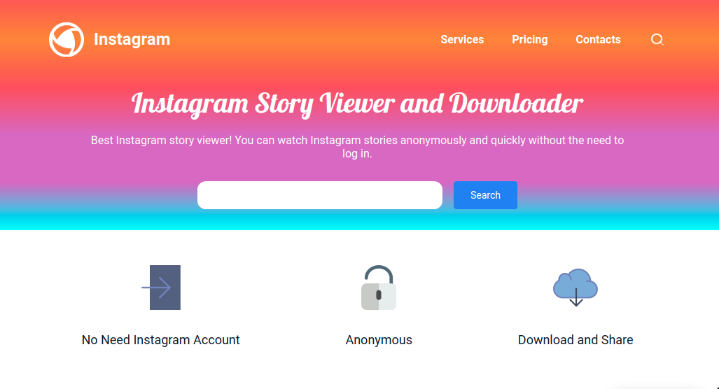
Instructions:
- The direction of the linear-gradient for the banner section should be different for devices below 768px and equal and above 768px.
- Use the HTML navelement to provide navigation links, either within the current document or to other documents.
- The links in the HTML navelement should be hidden in devices below 768px and visible in devices equal to and above 768px.
- The HTML input element and HTML button element for search should be hidden in devices below 768px.
- The features of the Instagram Story viewer should be displayed vertically in devices below 768px.
- The features of the Instagram Story viewer should be displayed horizontally in devices equal to and above 768px.
- Achieve the design using the CSS Flexbox layout and Media queries.
- Try to achieve the design as close as possible.
Resources
- https://assets.ccbp.in/frontend/intermediate-rwd/instagram-story-viewer-logo.png
- https://assets.ccbp.in/frontend/intermediate-rwd/search-icon-img.png
- https://assets.ccbp.in/frontend/intermediate-rwd/no-account-img.png
- https://assets.ccbp.in/frontend/intermediate-rwd/anonymous-img.png
- https://assets.ccbp.in/frontend/intermediate-rwd/download-img.png
CSS Colors used:
Linear Gradient Colors Hex Codes Used:
Text Color Hex Codes Used:
Background Color Hex Codes Used:
CSS Font families used:
- Roboto
- Lobster
Concepts Review
Want to quickly review some of the concepts you’ve been learning?
Take a look at the Cheat Sheets.
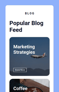
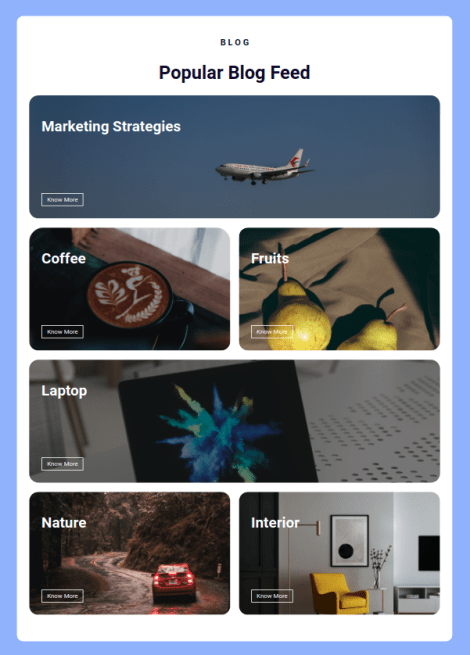
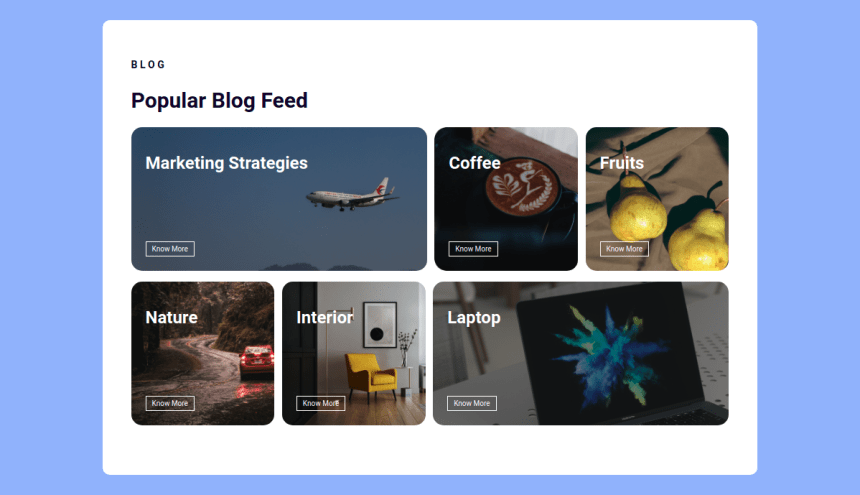
In this assignment, let's build a Popular Blog by applying the CSS concepts we learned till now.
Refer to the below images.
The following images illustrate all device sizes, from extra small to extra large.
Devices(size < 768px):
Devices (size >= 768px and size < 1200px):
Devices (Size >= 1200px):
Instructions:
- The page should have two different background images for Marketing Strategies and Laptop cards in devices below 768px and devices equal and above 768px.
- Add the given images as background images for the cards.
- For the devices below 992px the heading should be centered and for the rest of devices it should align to the left.
- Achieve the design using the CSS Flexbox layout and Media queries.
- Try to achieve the design as close as possible.
Resources
Use the image URL's given below.
Marketing
- For devices (size>768px) - https://assets.ccbp.in/frontend/intermediate-rwd/popular-blog-marketing-strategies-sm-bg.png
- For devices (size<=768px) - https://assets.ccbp.in/frontend/intermediate-rwd/popular-blog-marketing-strategies-lg-bg.png
Coffee
Fruits
Nature
Interior
Laptop
- For devices (size>768px) - https://assets.ccbp.in/frontend/intermediate-rwd/popular-blog-laptop-sm-bg.png
- For devices (size<=768px) - https://assets.ccbp.in/frontend/intermediate-rwd/popular-blog-laptop-lg-bg.png
CSS Colors used:
Background color Hex Code values:
Text color Hex Code values:
CSS Font families used:
- Roboto
Concepts Review
Want to quickly review some of the concepts you’ve been learning?
Take a look at the Cheat Sheets.
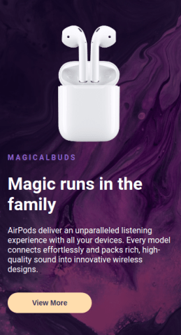
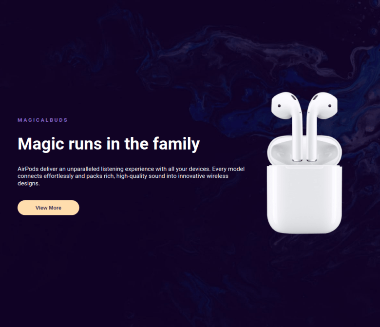
In this assignment, let's build a Product Launch Section by applying the CSS concepts we learned till now.
Refer to the below images.
The following images illustrate all device sizes, from extra small to extra large.
Devices (Size < 900px):
Devices (Size >= 900px):
Instructions:
- For the devices less than 900px, the width of image should be 180px and for the rest of devices it should be 300px.
- The page should have the image on the right in devices equals to and above 900px.
- The page should have the image on the top in devices below 900px.
- For the devices less than 900px, use align self property to align the image horizontally in the center.
- Achieve the design using the CSS Flexbox layout and Media queries.
- Try to achieve the design as close as possible.
Resources
Use the image URL's given below.
- https://assets.ccbp.in/frontend/intermediate-rwd/fairpods-darkpink-bg.png
- https://assets.ccbp.in/frontend/intermediate-rwd/fairpods-blue-bg.png
- https://assets.ccbp.in/frontend/intermediate-rwd/apple-fairpods-img.png
CSS Colors used:
Background color Hex Code values:
Text color Hex Code values:
CSS Font families used:
- Roboto
Concepts Review
Want to quickly review some of the concepts you’ve been learning?
Take a look at the Cheat Sheets.
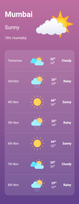
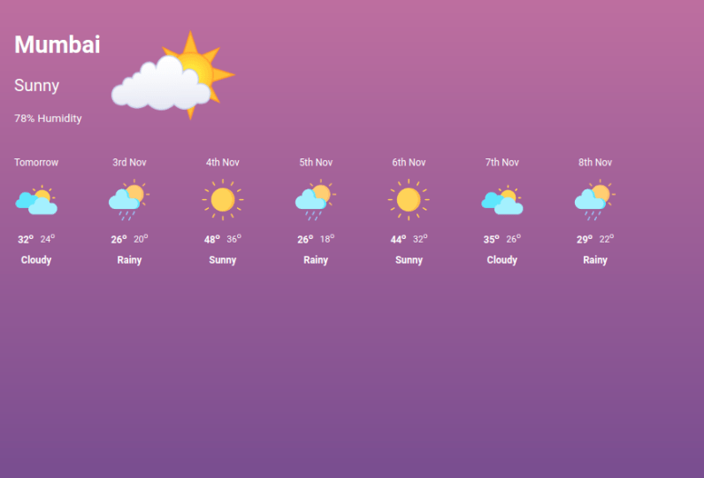
In this assignment, let's build a Weather Report Section by applying the CSS concepts we learned till now.
Refer to the below images.
The following images illustrate all device sizes, from extra small to extra large.
Devices (Size < 900px):
Devices (Size >= 900px):
Instructions:
- The weather conditions in the section should be horizontal for the devices equals to and above 900px.
- The weather conditions in the section should be vertical for the devices below 900px.
- For the weather conditions, use justify-content property with value space-around to occupy equal space for the devices less than 900px.
- The HTML Superscript element supspecifies inline text which is to be displayed as superscript. Refer to the prefilled HTML code.
- Achieve the design using the CSS Flexbox layout and Media queries.
- Try to achieve the design as close as possible.
Resources
Use the image URL's given below.
- https://assets.ccbp.in/frontend/intermediate-rwd/partly-sunny-img.png
- https://assets.ccbp.in/frontend/intermediate-rwd/partly-cloudy-img.png
- https://assets.ccbp.in/frontend/intermediate-rwd/rain-with-sun-img.png
- https://assets.ccbp.in/frontend/intermediate-rwd/sunny-img.png
CSS Colors used:
Background color Hex Codes values:
Border color Hex Code values:
Text color Hex Code values:
CSS Font families used:
- Roboto
Concepts Review
Want to quickly review some of the concepts you’ve been learning?
Take a look at the Cheat Sheets.
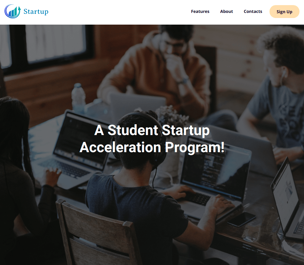
In this assignment, let's build an Responsive Navbar page by applying the CSS concepts we learned till now.
Refer to the below images.
The following images illustrate all device sizes, from extra small to extra large.
Extra Small (Size < 576px), Small (Size >= 576px):

Medium (Size >= 768px), Large (Size >= 992px), and Extra Large (Size >= 1200px):
Instructions:
- Use the HTML navelement to provide navigation links, either within the current document or to other documents.
- The links in the HTML navelement should be hidden in devices below 768px and visible in devices equal and above 768px.
- The page should have two different background images in devices below 768px and devices equal and above 768px.
By following the above instructions, achieve the given functionality.
- The links in the HTML navelement should be displayed when clicked on the menu icon in devices below 768px.
- The links in the HTML navelement should be hidden when clicked on the close icon in devices below 768px.
- Use classList.toggle()to show and hide the HTML elements.
- Achieve the design using the CSS Flexbox layout and Media queries and Javascript.
- The Icons used in this page are Font Awesome Icons.
- Try to achieve the design as close as possible.
Resources
- https://assets.ccbp.in/frontend/intermediate-rwd/landing-page-logo.png
- https://assets.ccbp.in/frontend/intermediate-rwd/landing-page-sm-bg.png
- https://assets.ccbp.in/frontend/intermediate-rwd/landing-page-lg-bg.png
CSS Colors used:
CSS Font families used:
- Open Sans
- Roboto
Concepts Review
Want to quickly review some of the concepts you’ve been learning?
Take a look at the Cheat Sheets.