React Chrono React Third Party


1. Third-Party Package 
react-chrono

NPM contains a react-chrono, a third-party package to display the timeline in your application.

It provides a React component

Chrono
to build a timeline that displays events chronologically.

Installation Command:

npm install react-chrono

1.1 Advantages

  • Can render the timelines in three different modes (horizontal, vertical, and tree).
  • Can autoplay the timeline with slideshow mode.
  • Can navigate the timeline via keyboard.

2. Chrono Props

We can provide different props to the ReactJS Chrono component. Below are some of the most commonly used props.

PropDescriptionDefault Value
modeSets the mode of the component'HORIZONTAL' (value can be 'HORIZONTAL', 'VERTICAL' or 'VERTICAL_ALTERNATING')
itemsCollection of Timeline Item Model[]
themeCustomises the colorsNo default value

2.1 mode

Example:

<Chrono mode="VERTICAL" />
JSX

2.2 items

The

items
prop is used to build the timeline. It is a collection of the Timeline Item Model.

Timeline Item Model is an object consist of the given properties:

NameDescriptionType
titletitle of the timeline itemString
cardTitletitle of the timeline cardString
cardSubtitletext of the timeline cardString
cardDetailedTextdetailed text of the timeline cardString or String[]
mediamedia object to set image or videoObject

Example:

.chrono-container {
width: 500px;
height: 400px;
}
CSS
import {Chrono} from 'react-chrono'
const items = [
{
title: 'May 1940',
cardTitle: 'Dunkirk',
cardSubtitle: 'Men of the British Expeditionary Force.',
cardDetailedText:
'On 10 May 1940, Hitler began his long-awaited offensive in the west by invading neutral Holland and attacking northern France.',
},
]
const App = () => (
<div className="chrono-container">
<Chrono items={items} />
</div>
)
export default App
 
JSX
Collapse

Output:

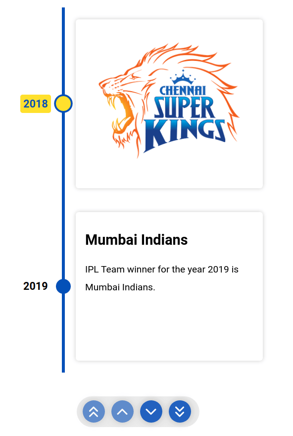
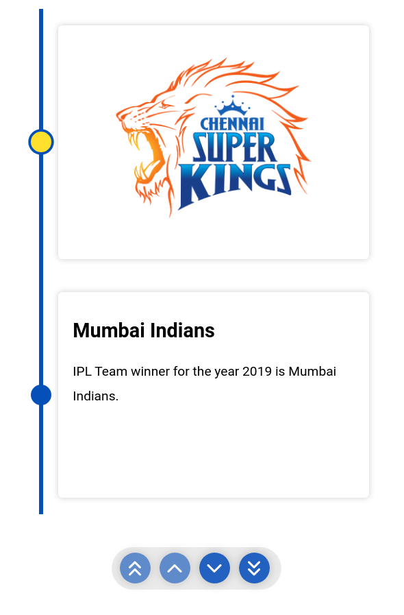
A single timeline item is created with the values of the Timeline Item Model in the

items
prop.

Warning

If any property misses in the Timeline Item Model, the respective value won't be displayed in the timeline item.

Note
The 
Chrono
 Component should be wrapped in a container that has a width and height.

2.3 theme

The colors can be customized with the

theme
prop.

Example:

<Chrono
theme={{
primary: "red",
secondary: "blue",
cardBgColor: "yellow",
cardForeColor: "violet",
titleColor: "red",
}}
/>
JSX

3. Rendering Custom Content

The custom content can be inserted by just passing the elements between the

Chrono
tags.

Example:

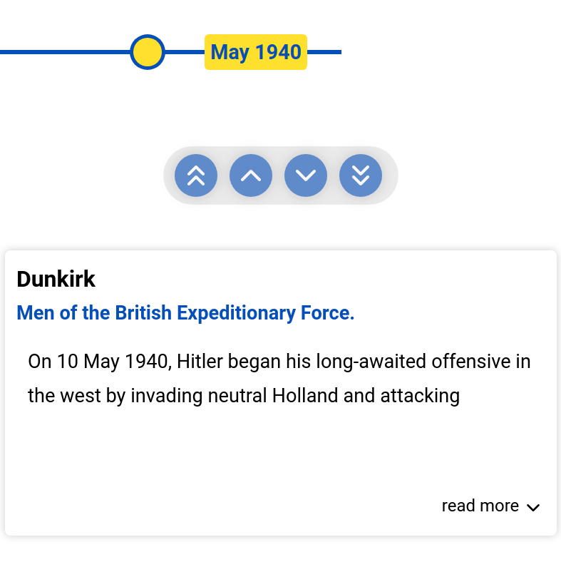
The below example will create two timeline items.

.chrono-container {
width: 400px;
height: 600px;
}
.image {
width: 200px;
height: 200px;
}
CSS
import {Chrono} from 'react-chrono'
const App = () => (
<div className="chrono-container">
<Chrono mode="VERTICAL">
<div>
<img
src="https://assets.ccbp.in/frontend/react-js/csk-logo-img.png"
className="image"
alt="chennai-super-kings"
/>
</div>
<div>
<h1>Mumbai Indians</h1>
<p>IPL Team winner for the year 2019 is Mumbai Indians.</p>
</div>
</Chrono>
</div>
)
export default App
JSX
Collapse

Output:

Each HTML

div
element is automatically converted into a timeline item and inserted into the timeline card.

Note
The 
items
 prop is optional and custom rendering is supported on all three modes.

Example:

The below example will set the title for the custom contents.

.chrono-container {
width: 400px;
height: 600px;
}
.image {
width: 200px;
height: 200px;
}
CSS
import {Chrono} from 'react-chrono'
const items = [{title: '2018'}, {title: '2019'}]
const App = () => (
<div className="chrono-container">
<Chrono mode="VERTICAL" items={items}>
<img
src="https://assets.ccbp.in/frontend/react-js/csk-logo-img.png"
className="image"
alt="chennai-super-kings"
/>
<div>
<h1>Mumbai Indians</h1>
<p>IPL Team winner for the year 2019 is Mumbai Indians.</p>
</div>
</Chrono>
</div>
)
export default App
JSX
Collapse

Output:

4. Reference

To know more about the

react-chrono
, you can refer to this.

Post a Comment

Please Select Embedded Mode To Show The Comment System.*

Previous Post Next Post

Contact Form