
1. Third-Party Package recharts
NPM contains recharts, a third-party package to display charts in your application.
It supports different types of charts like:
- Bar Chart
- Pie Chart
- Area Chart
- Composed Chart, etc.
It supports different types of visualization methods like:
Cartesian:
- Area
- Bar
- Line, etc.
Polar:
- Pie
- Radar
- Radial Bar
Installation Command:
1.1 Advantages
- Responsive
- Built for React, from scratch
- Customizable
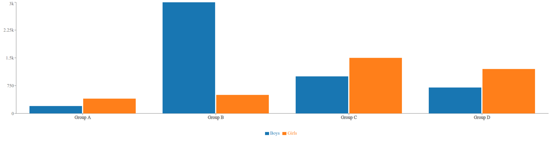
2. Bar Chart
The BarChart Component represents the container of the Bar Chart.
Example:
Output:
3. Components in Bar Chart
The
3.1 ResponsiveContainer
It is a container Component to make charts adapt to the size of the parent container.
Props:
We can provide different props to the ReactJS ResponsiveContainer Component. Below are some of the most commonly used props.
| Prop | Default Value |
|---|---|
| width | '100%' (value can be percentage string or number) |
| height | '100%' (value can be percentage string or number) |
3.2 XAxis
The XAxis Component represents the X-Axis of a Chart.
Props:
We can provide different props to the ReactJS XAxis Component. Below are some of the most commonly used props.
| Prop | Description | Default Value |
|---|---|---|
| dataKey | The key of the object in data that we want to display it's value on the axis | No default value (value can be string or number) |
| tick | Represents a tick | No default value. If false - No ticks will be drawn, object - Configuration of ticks, React element - Custom react element for drawing ticks (value can be boolean, object or React element) |
| tickFormatter | The formatter function of tick | No default value (Function) |
Example - tickFormatter:
If we want to show the thousands in the form of
3.3 YAxis
The YAxis Component represents the Y-Axis of a Chart.
The Props of the YAxis Component are similar to the XAxis Component.
3.4 Legend
The Legend Component represents the legend of a Chart.
By default, the content of the legend is generated by the name of
Props:
We can provide different props to the ReactJS Legend Component. Below are some of the most commonly used props.
| Prop | Description | Default Value |
|---|---|---|
| iconType | The type of icon in the legend item | No default value (value can be 'line', 'plainline', 'square', 'rect', 'circle', 'cross', 'diamond','star', 'triangle', or 'wye') |
| layout | The layout of legend items | 'horizontal' (value can be 'horizontal' or 'vertical') |
| verticalAlign | The alignment of legend items in vertical direction | 'middle' (value can be 'top', 'middle', or 'bottom') |
| align | The alignment of legend items in horizontal direction | 'center' (value can be 'left', 'center', or 'right') |
| wrapperStyle | The style of the legend container | No default value (value can be React Inline styles) |
3.5 Bar
The Bar Component represents a bar in the Chart.
Props:
We can provide different props to the ReactJS Bar Component. Below are some of the most commonly used props.
| Prop | Description | Default Value |
|---|---|---|
| dataKey | The key of the object in data that we want to display it's value | No default value (value can be string or number) |
| name | The name of the bar | No default value (value can be string or number) |
| fill | The color to fill the rectangle in a bar | (value can be given color in hexCode or string format) |
| barSize | The width or height of the bar | No default value (value can be number) |
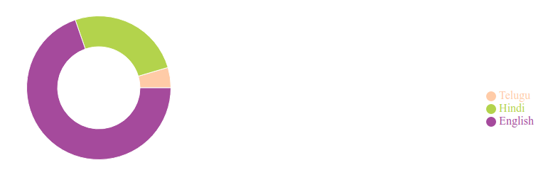
4. PieChart
The PieChart Component represents the container of the Pie Chart.
Example:
Output:
5. Components in Pie Chart
The
5.1 Pie
The Pie Component represents a pie in the Chart.
Props:
We can provide different props to the ReactJS Pie Component. Below are some of the most commonly used props.
| Prop | Description | Default Value |
|---|---|---|
| cx | The x-axis coordinate of a center point | '50%'. If set a percentage, the final value is obtained by multiplying the percentage of container width (value can be percentage string or number) |
| cy | The y-axis coordinate of a center point | '50%'. If set a percentage, the final value is obtained by multiplying the percentage of container height (value can be percentage string or number) |
| data | The source data in which each element is an object | No default value (value can be Array) |
| startAngle | The start angle of the first sector | 0 (value can be number) |
| endAngle | The end angle of the last sector, which should be unequal to startAngle | 360 (value can be number) |
| innerRadius | The inner radius of all the sectors | 0 (value can be percentage or number) |
| OuterRadius | The outer radius of all the sectors | 0 (value can be percentage or number) |
| dataKey | The key of the object in data that we want to display it's value on the sector | No default value |
5.2 Cell
The Cell Component represents the cell of a Chart.
It can be wrapped by a
Props:
We can provide different props to the ReactJS Cell Component. Below are some of the most commonly used props.
| Prop | Description | Default Value |
|---|---|---|
| name | The name of the cell | No default value (can be a string. This value can be taken as the content of the legend) |
| fill | The color to fill the cell | (value can be any color in hexCode or string format) |
6. Reference
To know more about the