React Popup Third Party Package


1. Third-Party Package 
reactjs-popup

NPM contains a reactjs-popup, a third-party package to display popup in your application.

It provides a React component that helps you create simple and complex Modals, Tooltips, and Menus for your application.

Installation Command:

npm install reactjs-popup

1.1 Advantages

  • ReactJS provides Modal, Tooltip, and Menu
  • Provides Support for controlled Modals & Tooltips

2. ReactJS Popup Props

We can provide different props to the ReactJS Popup component. Below are some of the most commonly used props.

PropDescriptionDefault Value
triggerRepresents the element to be rendered in-place where the Popup is definedJSX element
modalWhen set to true, Popup content will be displayed as a modal on the trigger of Popup. If not tooltip will be displayedfalse
positionDefines the position of the tooltip. It can be one of 'top left', 'top right', 'bottom right', 'bottom left'bottom center
openDefines the state of Popup. Whether it is opened or notfalse
overlayStyleCustom overlay styleobject

2.1 trigger Prop

File: src/components/ReactPopup/index.js

import Popup from 'reactjs-popup'
import 'reactjs-popup/dist/index.css'
import './index.css'
const ReactPopUp = () => (
<div className="popup-container">
<Popup
trigger={
<button className="trigger-button" type="button">
Trigger
</button>
}
>
<div>
<p>React is a popular and widely used programming language</p>
</div>
</Popup>
</div>
)
export default ReactPopUp
JSX
Collapse

File: src/components/ReactPopup/index.css

.trigger-button {
font-size: 16px;
font-weight: 400;
font-family: 'Roboto';
color: white;
padding: 8px 15px 8px 15px;
margin: 8px;
background-color: #7c69e9;
border: none;
border-radius: 4px;
outline: none;
}
.popup-container {
display: flex;
align-items: center;
justify-content: center;
height: 100vh;
}
CSS
Collapse

File: src/App.js

import ReactPopup from './components/ReactPopup'
const App = () => {
return <ReactPopup />
}
export default App
JSX
Note

The value of the trigger prop should be a JSX element.

2.2 modal Prop

File: src/components/ReactPopup/index.js

const ReactPopUp = () => (
<div className="popup-container">
<Popup
modal
trigger={
<button type="button" className="trigger-button">
Trigger
</button>
}
>
<p>React is a popular and widely used programming language</p>
</Popup>
</div>
)
export default ReactPopUp
JSX
Collapse

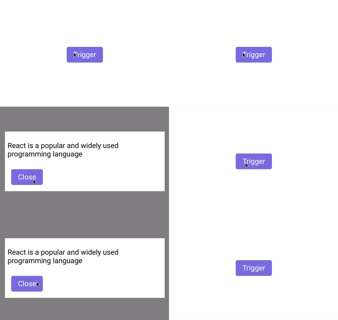
2.3 modal Prop with close button

File: src/components/ReactPopup/index.js

const ReactPopUp = () => (
<div className="popup-container">
<Popup
modal
trigger={
<button type="button" className="trigger-button">
Trigger
</button>
}
>
{close => (
<>
<div>
<p>React is a popular and widely used programming language</p>
</div>
<button
type="button"
className="trigger-button"
onClick={() => close()}
>
Close
</button>
</>
)}
</Popup>
</div>
)
export default ReactPopUp
JSX
Collapse

modal-with-close

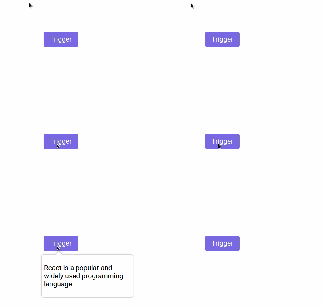
2.4 position Prop

File: src/components/ReactPopup/index.js

const ReactPopUp = () => (
<div className="popup-container">
<Popup
trigger={
<button type="button" className="trigger-button">
Trigger
</button>
}
position="bottom left"
>
<p>React is a popular and widely used programming language</p>
</Popup>
</div>
)
export default ReactPopUp
JSX
Collapse

tooltip

2.5 overlayStyle Prop

File: src/components/ReactPopup/index.js

const overlayStyles = {
backgroundColor: '#ffff',
}
const ReactPopUp = () => (
<div className="popup-container">
<Popup
modal
trigger={
<button type="button" className="trigger-button">
Trigger
</button>
}
overlayStyle={overlayStyles}
>
<p>React is a popular and widely used programming language</p>
</Popup>
</div>
)
export default ReactPopUp
JSX
Collapse

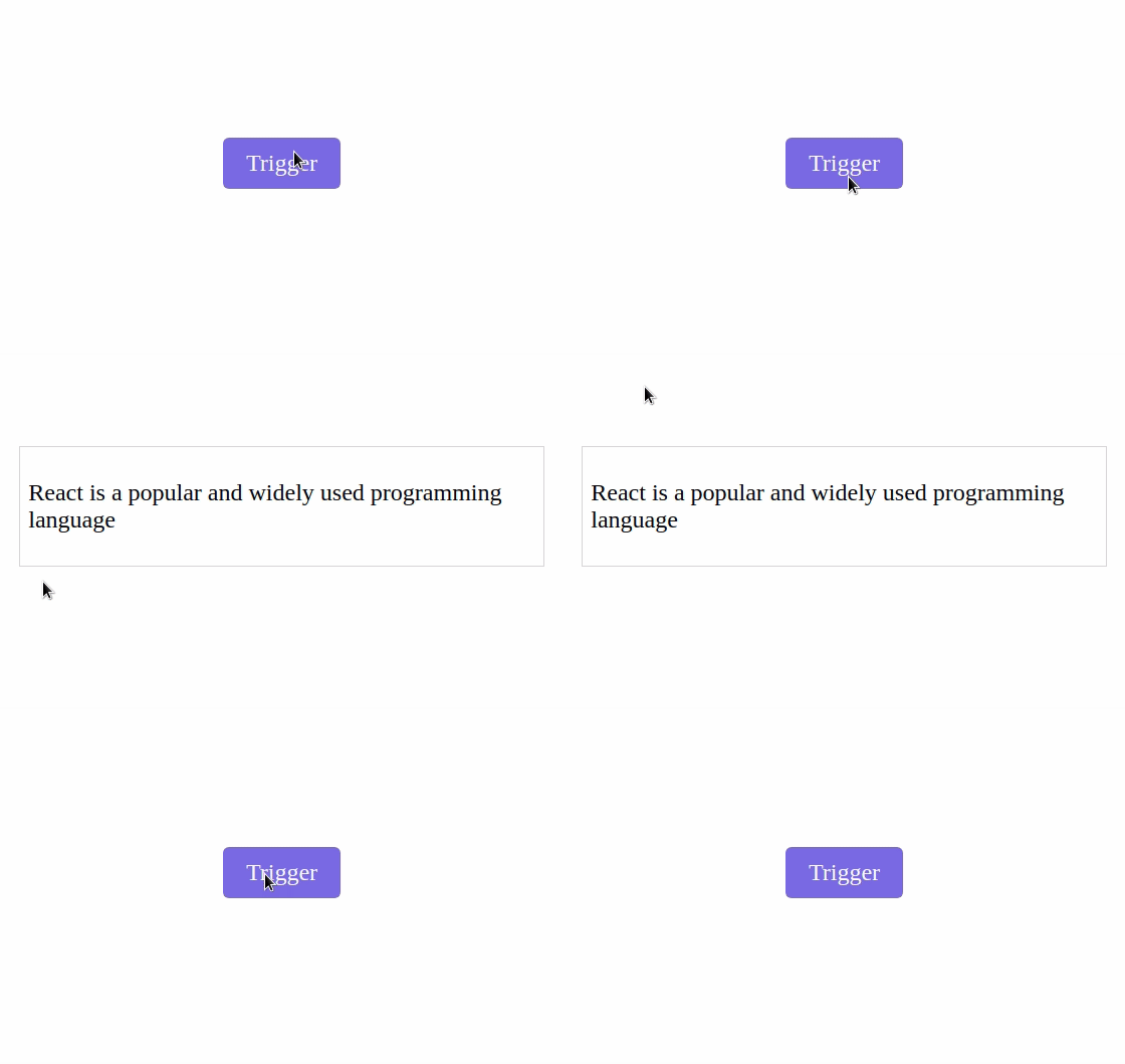
overlay

Reference

To know more about the

reactjs-popup
, you can refer to this.

Post a Comment

Please Select Embedded Mode To Show The Comment System.*

Previous Post Next Post

Contact Form