Design Section
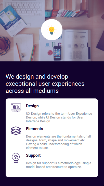
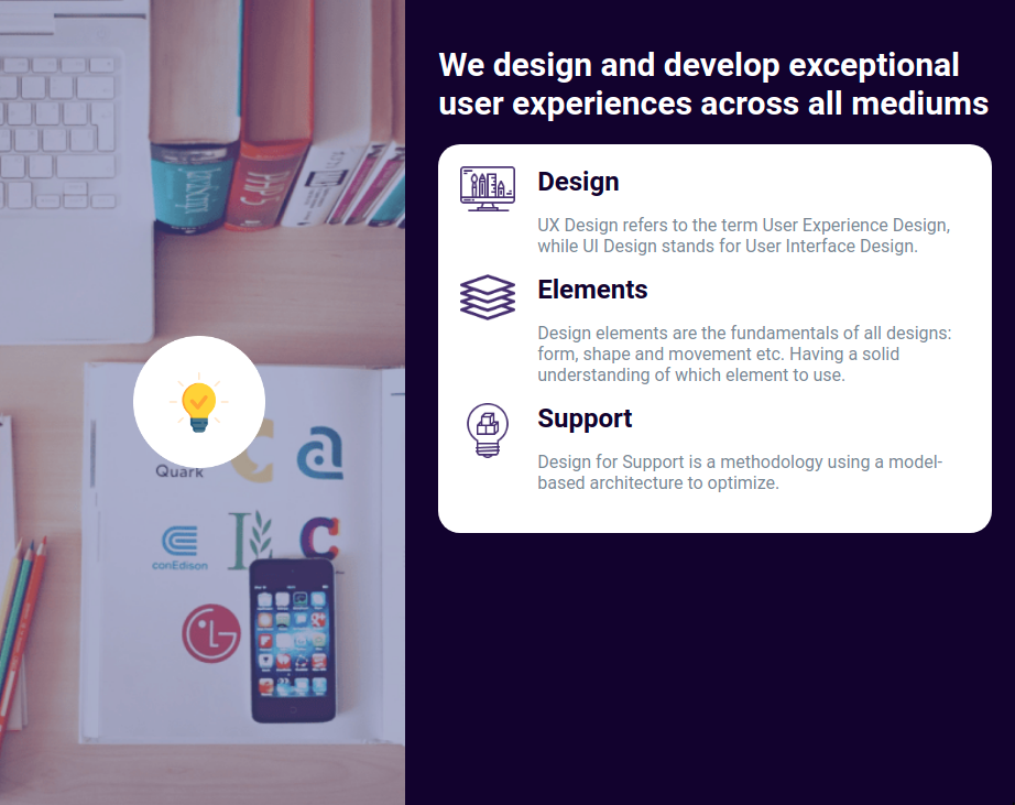
In this assignment, let's build a Design Section by applying the CSS concepts we learned till now.
Refer to the below images.
The following images illustrate all device sizes, from extra small to extra large.
Extra Small (Size < 576px), Small (Size >= 576px):

Medium (Size >= 768px), Large (Size >= 992px) and Extra Large (Size >= 1200px):

Instructions:
- The page should have two different background images in devices below 768px and devices equal and above 768px.
- The HTML main heading element should have different font-sizes in devices below 768px and devices equal and above 768px.
- Add the given images as background images to the HTML container element.
- Achieve the design using the CSS Flexbox layout and Media queries.
- Try to achieve the design as close as possible.
Resources
Use the image URL's given below.
- https://assets.ccbp.in/frontend/intermediate-rwd/design-section-sm-bg.png
- https://assets.ccbp.in/frontend/intermediate-rwd/design-section-lg-bg.png
- https://assets.ccbp.in/frontend/intermediate-rwd/design-section-bulb-img.png
- https://assets.ccbp.in/frontend/intermediate-rwd/design-section-1-img.png
- https://assets.ccbp.in/frontend/intermediate-rwd/design-section-2-img.png
- https://assets.ccbp.in/frontend/intermediate-rwd/design-section-3-img.png
CSS Colors used:
Background color Hex Code values:
Text color Hex Code values:
CSS Font families used:
- Roboto
Concepts Review
Want to quickly review some of the concepts you’ve been learning?
Take a look at the Cheat Sheets.
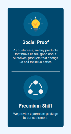
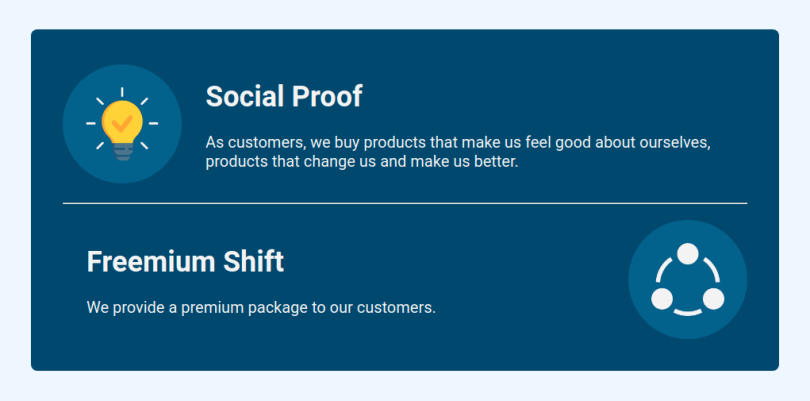
In this assignment, let's build a Freemium Business Model by applying the CSS concepts we learned till now.
Refer to the below images.
The following images illustrate all device sizes, from extra small to extra large.
Extra Small (Size < 576px), Small (Size >= 576px):

Medium (Size >= 768px), Large (Size >= 992px) and Extra Large (Size >= 1200px):

Instructions:
- For the devices less than 768px, the width of image should be 120px and for the rest of devices it should be 150px.
- For the devices less than 768px, the size of heading should be 24px and for the rest of devices it should be 36px.
- Achieve the design using the CSS Flexbox layout and Media queries.
- Try to achieve the design as close as possible.
Resources
Use the image URL's given below.
- https://assets.ccbp.in/frontend/intermediate-rwd/freemium-business-model-1-img.png
- https://assets.ccbp.in/frontend/intermediate-rwd/freemium-business-model-2-img.png
CSS Colors used:
Background color Hex Code values:
Text color Hex Code values:
CSS Font families used:
- Roboto
Concepts Review
Want to quickly review some of the concepts you’ve been learning?
Take a look at the Cheat Sheets.
