
1. Component
A Component is a JS function that returns a JSX element.
The component name should always start with a capital letter as react treats the components starting with lowercase letters as HTML elements.
We can call the function with self-closing tags as shown above
1.1 Properties (Props)
React allows us to pass information to a component using props.
1.1.1 Passing Props
We can pass props to any component as we declare attributes for any HTML element.
Syntax:
1.1.2 Accessing Props
The components accept props as parameters and can be accessed directly.
Syntax:
1.2 Component is Reusable
A Component is a piece of reusable code that can be used in various parts of an application.
Example:
1.3 Component is Composable
We can include a component inside another component.
2. Third-party Packages
Creating a real-world app involves lot of setup because a large number of components need to be organised.
Facebook has created a third-party package,
2.1 create-react-app
Installation Command:
It installs
2.1.1 Creating a React Application
2.1.2 React Application Folder Structure
- public/folder: Where we will keep assets like images, icons, videos etc
- src/folder: Where we will do the majority of our work. All of our React components will placed here.
- node_modules
- package-lock.json
node_modules:
This directory contains dependencies and sub-dependencies of packages used by the current react app, as specified by package.json.
package-lock.json:
This file contains the exact dependency tree installed in
The
2.1.3 Starting a React Application
Run the below command from the React application directory.
You can view the application in the URL
2.2 Pre-Configured tools
The
- Live editing: Allows React components to be live reloaded.
- ESLint: Analyzes source code to report programming errors, bugs, and syntax errors.
- Prettier: Enforces a consistent style for indentation, spacing, semicolons and quotes, etc.
- Babel: Compiles JSX into Regular JavaScript
- Webpack: Stitches together a group of modules into a single file (or group of files). This process is called Bundling.
In this project, let's build a Social Buttons by applying the concepts we have learned till now.
Refer to the image below:

Design Files
Click to view
Completion Instructions
Implementation Files
Use these files to complete the implementation:
- index.js
- index.css
Resources
Colors
Font-families
- Roboto
- Bree Serif
Things to Keep in Mind
- Do not remove the pre-filled code
- Want to quickly review some of the concepts you’ve been learning? Take a look at the Cheat Sheets.
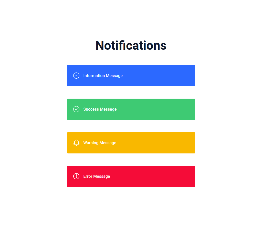
In this project, let's build a Notifications app by applying the concepts we have learned till now.
Refer to the image below:
Design Files
Click to view
Completion Instructions
Implementation Files
Use these files to complete the implementation:
- index.js
- index.css
Resources
Image URLs
Colors
Font-families
Things to Keep in Mind
- Do not remove the pre-filled code
- Want to quickly review some of the concepts you’ve been learning? Take a look at the Cheat Sheets.
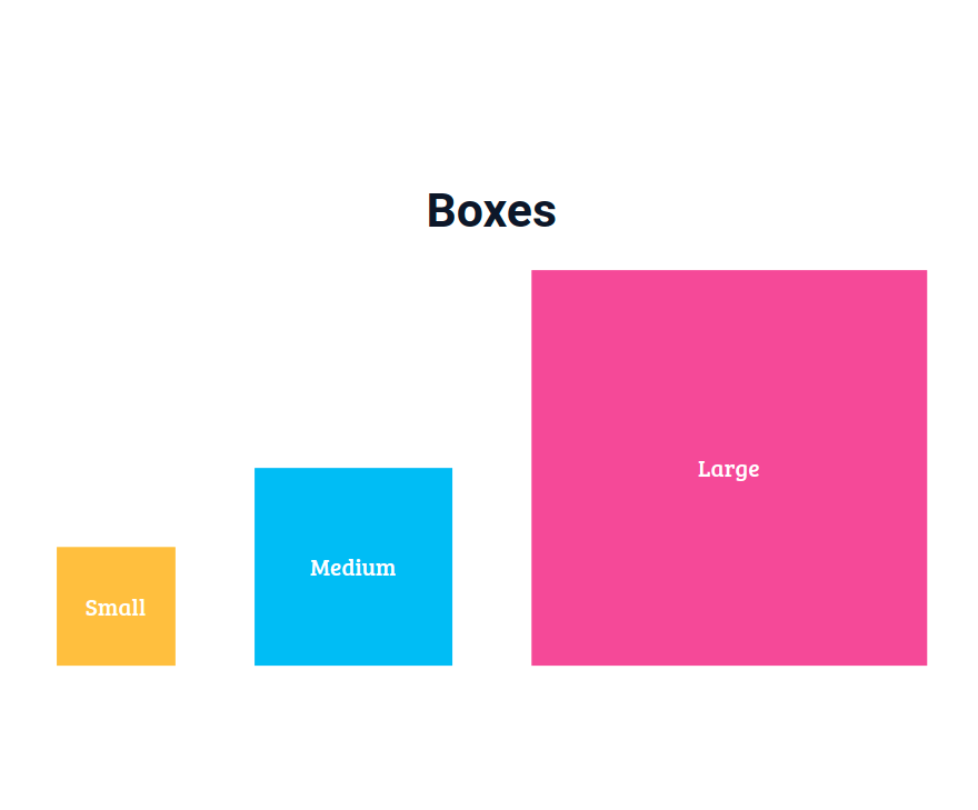
In this project, let's build a Boxes page by applying the concepts we have learned till now.
Refer to the image below:
Design Files
Click to view
Completion Instructions
Implementation Files
Use these files to complete the implementation:
- index.js
- index.css
Resources
Colors
Font-families
- Roboto
- Bree Serif
Things to Keep in Mind
- Do not remove the pre-filled code
- Want to quickly review some of the concepts you’ve been learning? Take a look at the Cheat Sheets.