
1 . Conditional Rendering
Conditional Rendering allows us to render different elements or components based on a condition.
Different ways to implement Conditional Rendering are:
- Using an If...Else Statement
- Using Element Variables
- Using Ternary Operators
- Using Logical && Operator
1.1 Using an If...Else Statement
1.2 Using Element Variables
1.3 Using Ternary Operators
1.4 Using Logical && Operator
2. Default Props
defaultProps is a property in React Component used to set default values for the props. This is similar to adding default parameters to the function.
Syntax:
Example:
File: src/Welcome/index.js
File: src/App.js
In this project, let's build a Welcome App by applying the concepts we have learned till now.
Refer to the image below:

Design Files
Click to view
Set Up Instructions
Click to view
- Download dependencies by running npm install
- Start up the app using npm start
Completion Instructions
Functionality to be added
The app must have the following functionalities
- When the page is opened, a button should be displayed with text content as Subscribe
- When the Subscribe button is clicked
- The text content in the Subscribe button should be changed to Subscribed
- When the Subscribed button is clicked
- The text content in the Subscribed button should be changed to Subscribe
Implementation Files
Use these files to complete the implementation:
- src/components/Welcome/index.js
- src/components/Welcome/index.css
Important Note
Click to view
The following instructions are required for the tests to pass
- Achieve the given layout using only Conditional Rendering
Resources
Colors
Font-families
- Bree Serif
Things to Keep in Mind
- All components you implement should go in the
src/componentsdirectory.- Don't change the component folder names as those are the files being imported into the tests.
- Do not remove the pre-filled code
- Want to quickly review some of the concepts you’ve been learning? Take a look at the Cheat Sheets.
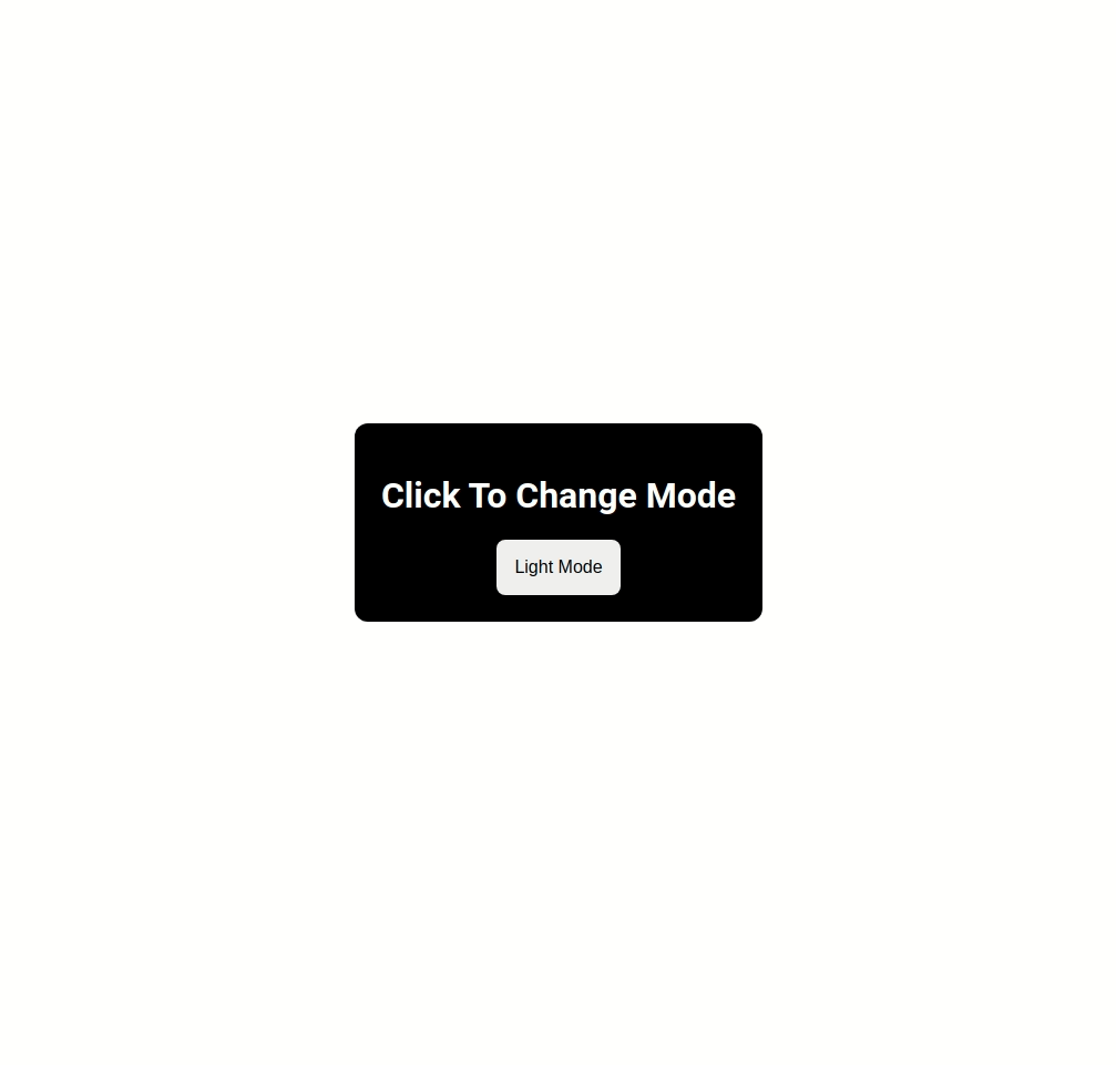
In this project, let's build a Light Dark Mode app by applying the concepts we have learned till now.
Refer to the image below:
Design Files
Click to view
Set Up Instructions
Click to view
- Download dependencies by running npm install
- Start up the app using npm start
Completion Instructions
Functionality to be added
The app must have the following functionalities
- When the app is opened, the UI should be displayed in Dark mode
- When the app is in Dark mode and the Light Mode button is clicked
- The UI should be displayed in Light mode
- The text content in the button should be changed to Dark Mode
- When the app is in Light mode and the Dark Mode button is clicked
- The UI should be displayed in Dark mode
- The text content in the button should be changed to Light Mode
Implementation Files
Use these files to complete the implementation:
- src/components/LightDarkMode/index.js
- src/components/LightDarkMode/index.css
Important Note
Click to view
The following instructions are required for the tests to pass
- Achieve the given layout using only Conditional Rendering
Resources
Colors
Font-families
- Roboto
Things to Keep in Mind
- All components you implement should go in the
src/componentsdirectory.- Don't change the component folder names as those are the files being imported into the tests.
- Do not remove the pre-filled code
- Want to quickly review some of the concepts you’ve been learning? Take a look at the Cheat Sheets.
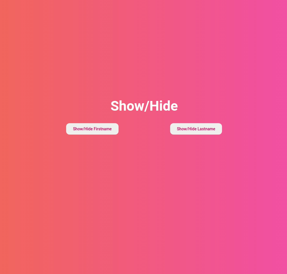
In this project, let's build a Show/Hide App by applying the concepts we have learned till now.
Refer to the image below:
Design Files
Click to view
Set Up Instructions
Click to view
- Download dependencies by running npm install
- Start up the app using npm start
Completion Instructions
Functionality to be added
The app must have the following functionalities
- The Firstname and Lastname should be hidden initially
- When the Show/Hide Firstname button is clicked,
- If the Firstname is hidden, then it should be displayed
- If the Firstname is displayed, then it should be hidden
- When the Show/Hide Lastname button is clicked,
- If the Lastname is hidden, then it should be displayed
- If the Lastname is displayed, then it should be hidden
Implementation Files
Use these files to complete the implementation:
- src/components/ShowHide/index.js
- src/components/ShowHide/index.css
Important Note
Click to view
The following instructions are required for the tests to pass
- Achieve the given layout using only Conditional Rendering
Resources
Colors
Font-families
- Roboto
Things to Keep in Mind
- All components you implement should go in the
src/componentsdirectory.- Don't change the component folder names as those are the files being imported into the tests.
- Do not remove the pre-filled code
- Want to quickly review some of the concepts you’ve been learning? Take a look at the Cheat Sheets.
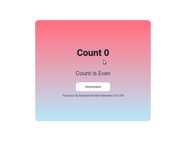
In this project, let's build an Even Odd App by applying the concepts we have learned till now.
Refer to the image below:
Design Files
Click to view
Set Up Instructions
Click to view
- Download dependencies by running npm install
- Start up the app using npm start
Completion Instructions
Functionality to be added
The app must have the following functionalities
- Initially, the count should be 0 and Count is Even text should be displayed
- When the Increment button is clicked,
- The count should be increased by a random value between 0 to 100
- If the incremented count is an even number, then the Count is Even text should be displayed
- If the incremented count is an odd number, then the Count is Odd text should be displayed
Implementation Files
Use these files to complete the implementation:
- src/components/EvenOddApp/index.js
- src/components/EvenOddApp/index.css
Important Note
Click to view
The following instructions are required for the tests to pass
- Achieve the given layout using only Conditional Rendering
Resources
Colors
Font-families
- Roboto
Things to Keep in Mind
- All components you implement should go in the
src/componentsdirectory.- Don't change the component folder names as those are the files being imported into the tests.
- Do not remove the pre-filled code
- Want to quickly review some of the concepts you’ve been learning? Take a look at the Cheat Sheets.
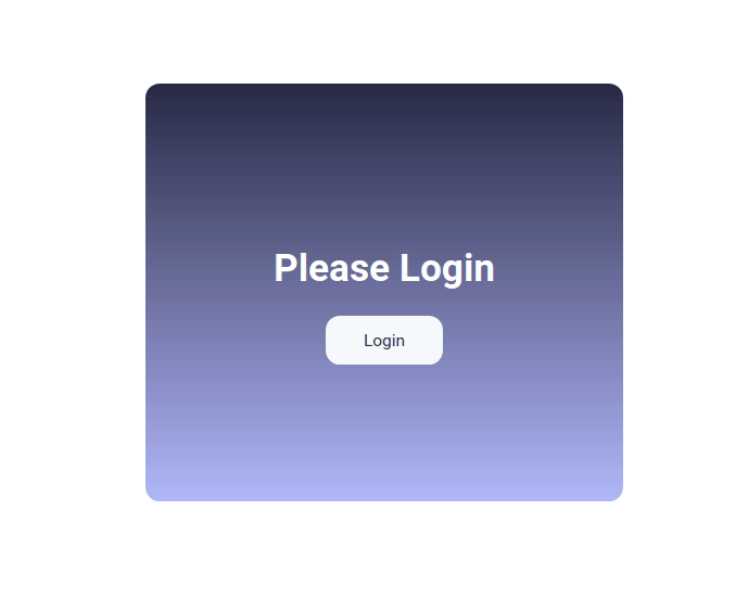
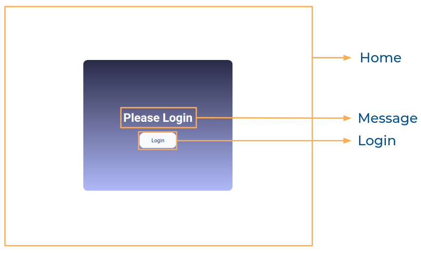
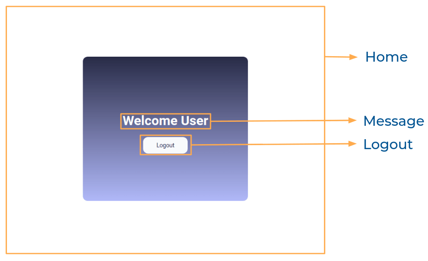
In this project, let's build a Login App by applying the concepts we have learned till now.
Refer to the image below:
Design Files
Click to view
Set Up Instructions
Click to view
- Download dependencies by running npm install
- Start up the app using npm start
Completion Instructions
Functionality to be added
The app must have the following functionalities
- Initially, Please Login message and Login button should be displayed
- When the Login button is clicked,
- Welcome User message and Logout button should be displayed
- When the Logout button is clicked,
- Please Login message and Login button should be displayed
Components Structure
Implementation Files
Use these files to complete the implementation:
- src/components/Home/index.js
- src/components/Home/index.css
- src/components/Login/index.js
- src/components/Login/index.css
- src/components/Logout/index.js
- src/components/Logout/index.css
- src/components/Message/index.js
- src/components/Message/index.css
Important Note
Click to view
The following instructions are required for the tests to pass
- Achieve the given layout using only Conditional Rendering
Resources
Colors
Font-families
- Roboto
Things to Keep in Mind
- All components you implement should go in the
src/componentsdirectory.- Don't change the component folder names as those are the files being imported into the tests.
- Do not remove the pre-filled code
- Want to quickly review some of the concepts you’ve been learning? Take a look at the Cheat Sheets.